Introduction
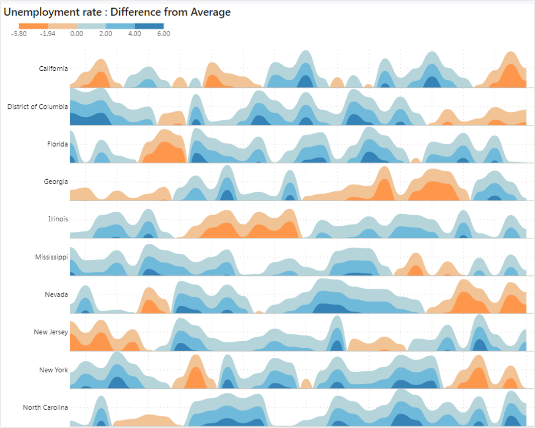
The Powerviz Horizon chart chart is a two-dimensional data visualization that shows quantitative data across a continuous interval, usually a time period. It is a compact area chart that compares data across multiple categories. The layered view allows for more categories to be seen within the same space, which improves comparison and pattern detection.
It is available for download on AppSource & directly from the website. Powerviz visual allow you to control number of layers, baseline, conditional formatting, annotation and more.
This documentation will help you get started with the Horizon chart by explaining everything you need to know about it. If you're new to our site, check out the visual library for other visuals that met your requirements.
Powerviz Horizon chart highlights include:
Horizon Options- Customize the Horizonarea,scale, &base values.- Create
custom themes& save and share them inJSON file. Display Style- Choose from a variety of curvature styles -natural,linear, andstep- to effortlessly create impactful designs.- Apply color with
by layeroption to create custom bands. - Customize with a wide range of options, including
6 color schemesand over30+ stunning palettesto choose from. In addition, applyconditional formattingrules. - Control the
scalingand number oflayersof the Horizon area with precision. - Add
Reference linesto highlight a range or a data point. - Choose from a wide range of pre-designed
fill patternsor upload your design. Ranking,sorting,gridlines, & other such features are available too.
Follow this guide to have an in-depth view of the Powerviz Horizon chart. To know more about other Powerviz visuals and slicers, visit our library or contact us directly for a demo.
Examples